Petite Frites
Petite Frites is a fine jewelry brand redefining what’s expected from traditional diamond jewelry. With a cheeky, irreverent approach, they use lab-grown diamonds and recycled 18K gold to create designs that feel both playful and elevated.
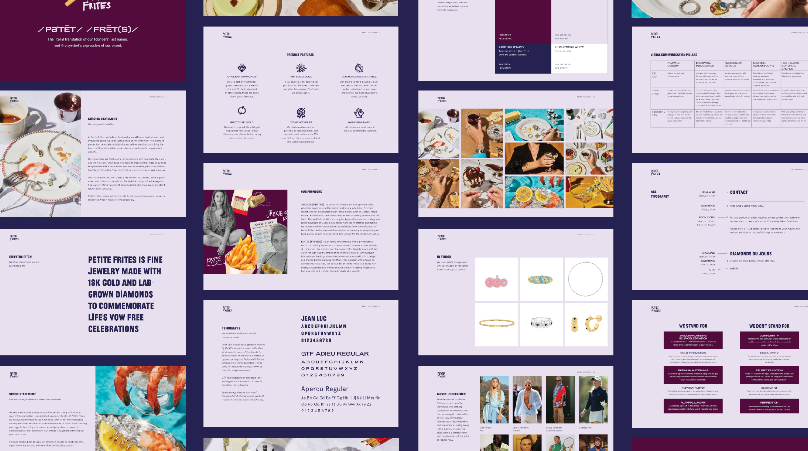
The brand began with a hand-drawn logo—sketched by one of the founders—and came to us for help bringing it to market. Working closely with the founders, we developed a comprehensive brand book, establishing a clear identity to guide all internal and external communications. All of the copy was written by founder Jackie Little, whose witty, smart, and engaging voice brought the brand story to life. It was a joy to collaborate with her words as we built the visual foundation.
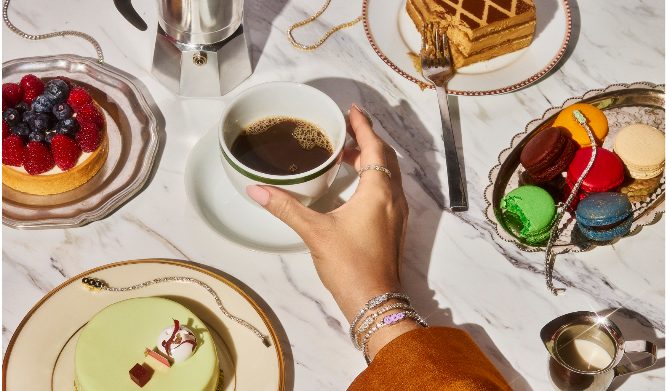
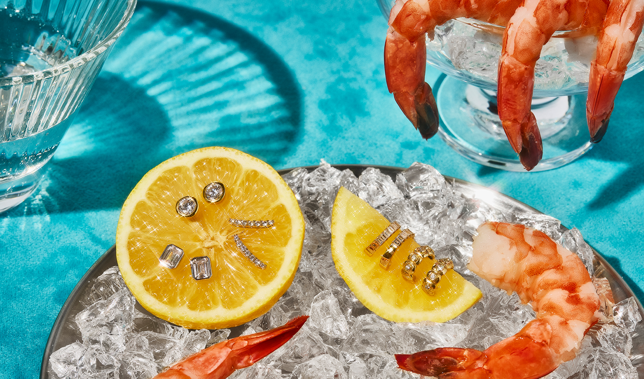
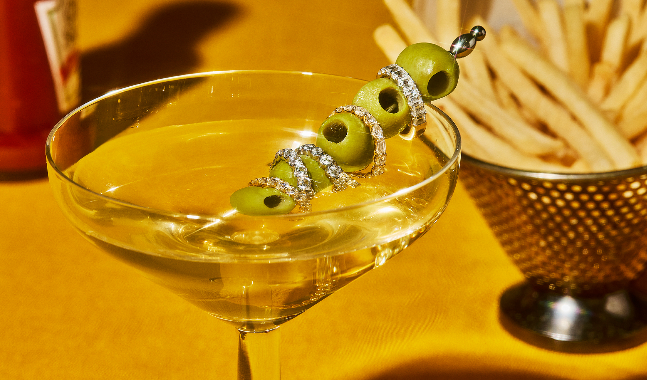
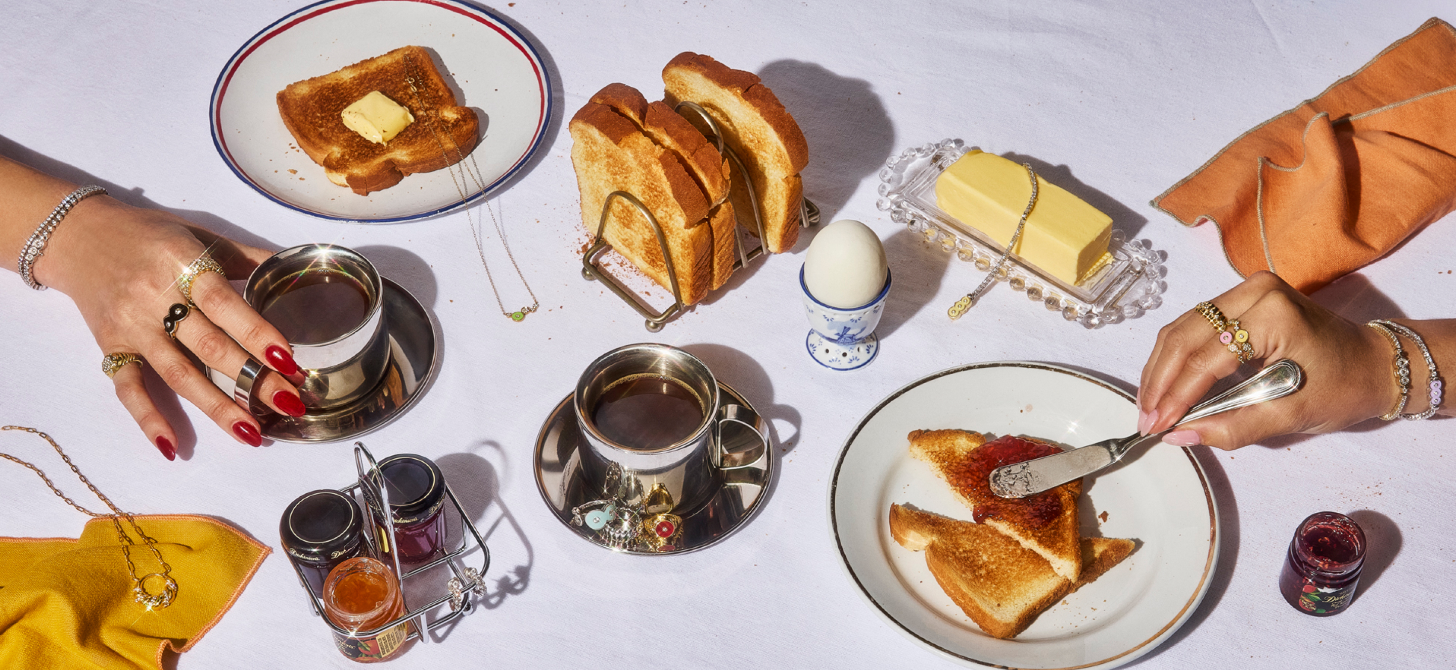
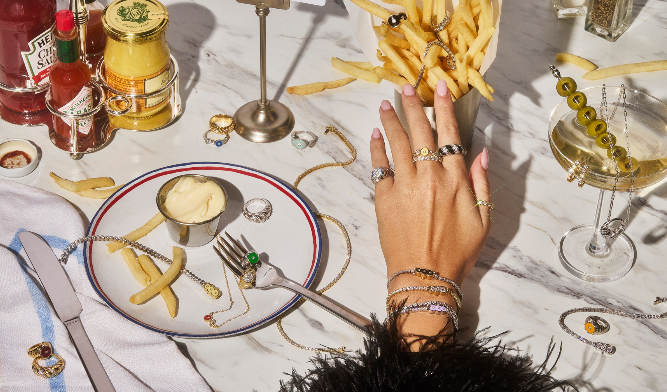
Inspired by the brand’s muse—The Bistro—we concepted a photoshoot to bring this world to life. We created a detailed moodboard featuring scenes, props, and storytelling cues, all thoughtfully curated to express the Petite Frites spirit. The shoot was executed in collaboration with the incredible Stephanie Gonot (photographer) and Amy Taylor (prop stylist), whose talents helped elevate the concept into something uniquely memorable.
We designed a Shopify website that introduces the brand while reflecting its bistro-inspired charm, complete with “menu board” design elements that make the customer journey feel fresh and intuitive.
Our role
Branding
Illustration
Photography
Website Design
COLLABORATORS
Jackie Little, copy
Stephanie Gonot, photography
Amy Taylor, prop styling
We added a few subtle french fry Easter eggs throughout the site, a playful nod to the brand name that rewards curious customers.
Product pages highlight the brand’s commitment to quality with handdrawn icons denoting features like 18K recycled gold, FG-VS lab-grown diamonds, RJC certification, and hand finishing. Each page also includes a helpful FAQ section so customers can quickly access shipping details, return policies, and other common questions without leaving the page.
One of the most exciting innovations from Petite Frites is their reinvention of the classic tennis bracelet. Instead of hiding the clasp, they’ve made it a standout feature. Their interchangeable clasp system allows customers to style, switch, and personalize their bracelets with ease.
To support this entirely new way of shopping for diamond tennis bracelets, we created a dedicated landing page with three distinct shopping paths:
1. The Bracelet Builder – For those who want to create their own bracelet and clasp combo from scratch:
2. Perfect Pairings – Pre-designed bracelet and clasp sets for easy shopping:
3. À La Carte – Individual bracelets and clasps for returning customers who want to expand their collection: